
Perfect Properties
The Real Estate App
Problem
Real estate investment has gained significant popularity among individuals seeking financial stability. However, it is a complex and intricate process that requires guidance.
Despite the abundance of blogs and agencies that provide information, first-time buyers may find it challenging to initiate the process without professional guidance. This can lead to the wastage of valuable time in viewing properties outside their budget.
Solution
Perfect Properties is a dynamic, responsive web app that offers prospective comprehensive information about properties of interest and assists buyers with the necessary expertise to streamline the process of getting started on buying a home.
Roles
UI Designer
Tools
Figma
Adobe XD
Miro
Timeline
1 month
The Design Process
Discover
Define
Ideate
Design
Iterate
5 W's
User Persona
User Stories
User Flow
Sketches
Wireframes
Mood Board
Style Guide
Final Design
Mockups
Discover
5 W's
Who? This web app is made primarily for new, small-scale property buyers who are looking to invest for additional income or financial security.
What? This will be a user-friendly, responsive web app containing a database of available residential properties and land, and comprehensive information on each listing.
When? Buyers will use this tool when conducting property searches, and making a decision about where to invest.
Where? Buyers will use this tool at home or on the go. Users can search for properties anywhere, as long as they’re logged in on a device.
Why? Unseasoned buyers need access to reliable, uncomplicated information about their potential property investments. Buyers get a feel for a place by viewing comprehensive information about the property and its neighborhood before spending time on-site.

Define

User Persona
For this project, I was presented with a comprehensive brief that outlined specific requirements that I would utilize to inform the design of the project. Through this process, I was able to develop a detailed persona that represented the target user group. This persona facilitated a thorough understanding of the unique needs, objectives, and experiences of potential users.
User Stories
The project brief included strategic objectives that outlined the desired outcomes for the web application. By creating a comprehensive persona based on these objectives, I was able to accurately identify the user's needs, goals, and expectations. These user stories were invaluable in keeping the project on track and ensuring that the final solution effectively addressed the user's pain points
As a user:
-
I want to be able to search and filter properties, so that I can find good matches based on my needs.
-
I want to be able to save or mark properties I am interested in, so that I can easily revisit them.
-
I want access to as much written and visual information as possible about properties I’m interested in, so that I can make an informed decision.
-
I want to be able to contact the right people if I am interested in viewing a property, so that I schedule a viewing.
As a user, I want to be able to contact the right people if I am interested in viewing a property, so that I can schedule a viewing.

~Target Audience User
Ideate

User Flow
Next, I developed a user flow that outlines the sequence of screens Rashida will need to navigate through in order to accomplish her tasks on the web application.
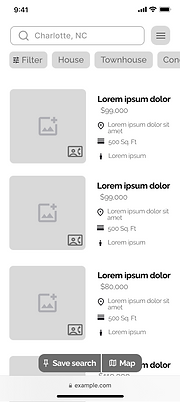
Design
Wireframes
After completing the user flow diagram, I proceeded to create low-fidelity wireframes that outlined the layout and content of each screen. As I progressed to the mid-fidelity wireframes, my focus shifted towards incorporating flexible content blocks to ensure optimal display across different devices and screen sizes.


Moodboard
As part of the design process, I curated two moodboards to establish a visual direction and narrative for the project. Following a careful evaluation, I ultimately selected Moodboard 1 as it closely aligned with the intended character portrayal of the target user, Rashida.


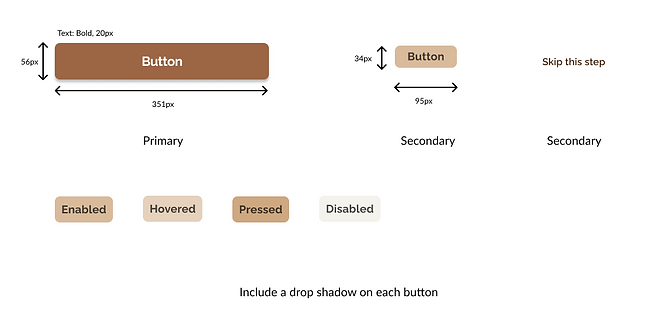
Style Guide
Color

Typography

Logo
Buttons

Iconography

UI Elements

Imagery


Iterate
High-Fidelity Prototype - Final Designs


Animations
I hoped to improve the overall experience for my users by including a few animations into my designs. These animations offered users a bit of enjoyment by making the web app come to life.
%20Screen.png)
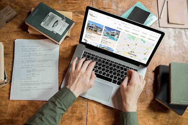
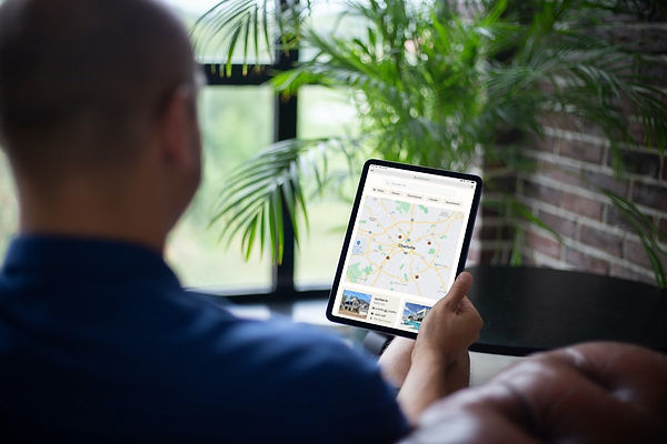
Polished Mockups
After finalizing the mobile-first approach, I implemented the principles of progressive enhancement to optimize the design for responsive breakpoints. The design was carefully adjusted to ensure that it provides the best user experience regardless of the device being used. To showcase the design and provide a clear visual representation of the web app, I created detailed mockups.


Conclusions
Challenges
During the design process of this project, I encountered a significant challenge when designing for different breakpoints. While the larger screens presented the opportunity to include more content, I recognized the importance of optimizing the available space without overloading it. Thus, I focused on determining which content was crucial for each breakpoint while also prioritizing the user's experience. Ultimately, this approach enabled me to strike the right balance between content and whitespace, resulting in a well-designed and intuitive user interface.
What I've Learned
-
The mood board served as a critical guide for providing direction to the project's design and overall direction.
-
Maintaining a consistent visual hierarchy within a user interface design plays a significant role in effectively communicating a captivating story to the user, in a manner that is both clear and straightforward.
-
Concentrating on integrating UI elements into my work allowed me to add more value and refine my skill set. I recognized the importance of improving deliverable quality and making products easily navigable.
Next Steps
-
Conduct usability testing to identify areas for improvement and continue enhancing the design and usability of Perfect Properties.
-
Explore opportunities to expand the functionality of Perfect Properties on desktop and tablet devices, taking into account the unique user experiences and behaviors on these platforms.